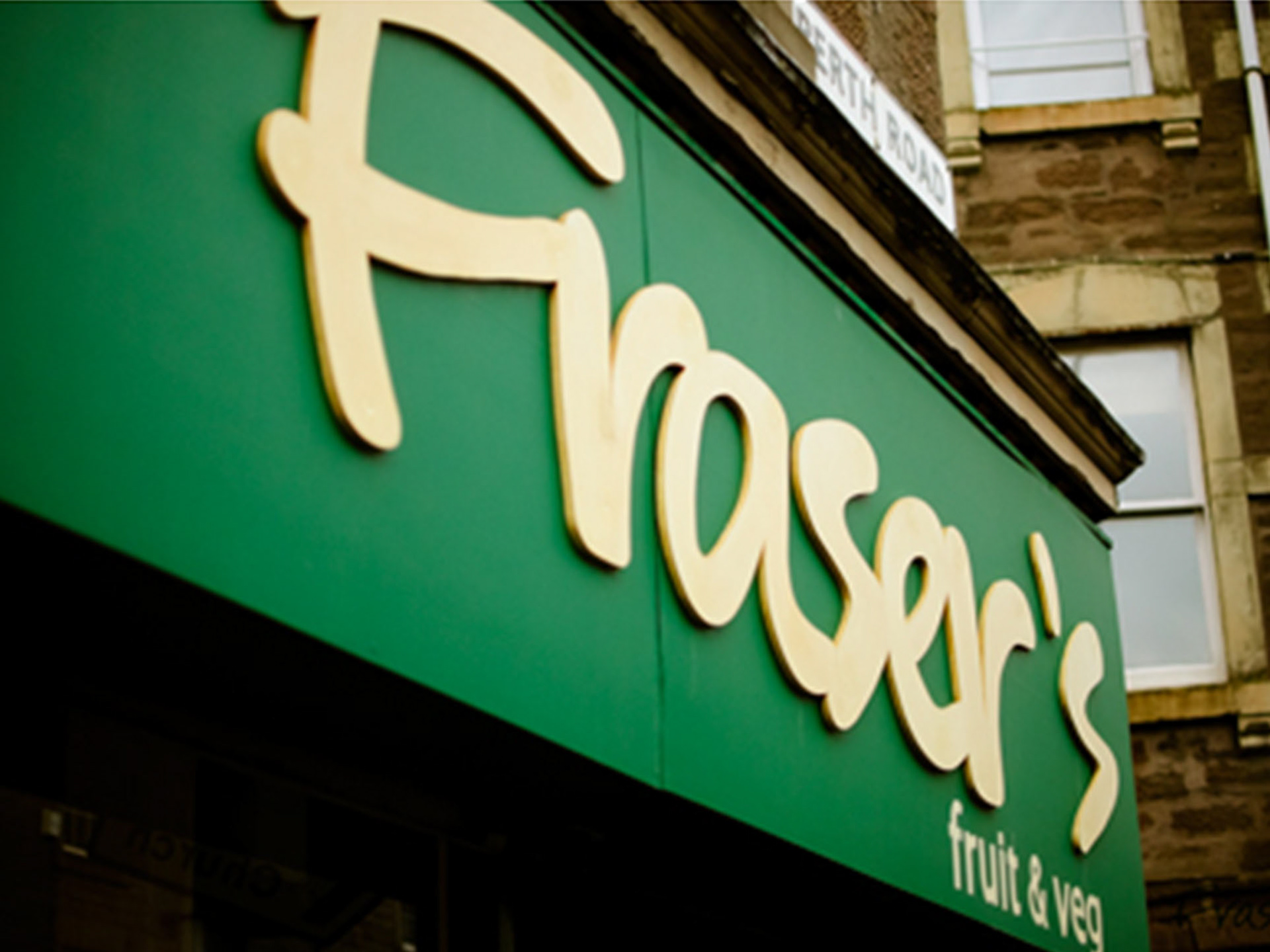
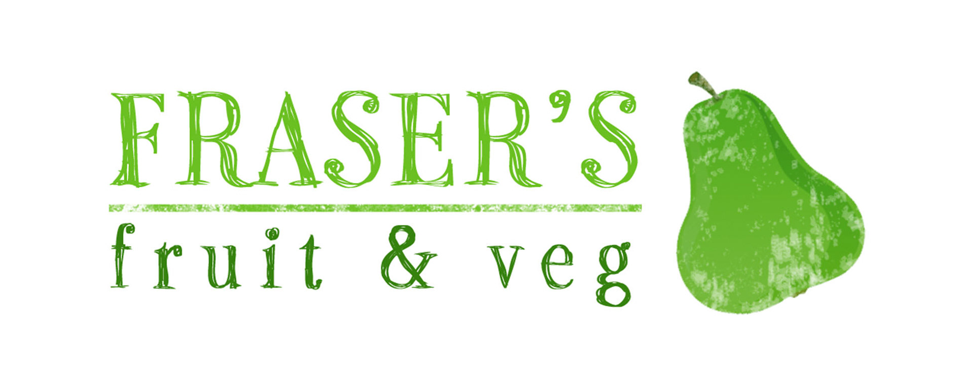
Fraser's Fruit and Veg is a local fresh fruit and vegetables business based out of the Perth Road in Dundee. I am currently working on building their brand new website but we decided to do some logo work for the site before starting any builds. This is the original shop signage. I started to use this as my basis for the logo build.
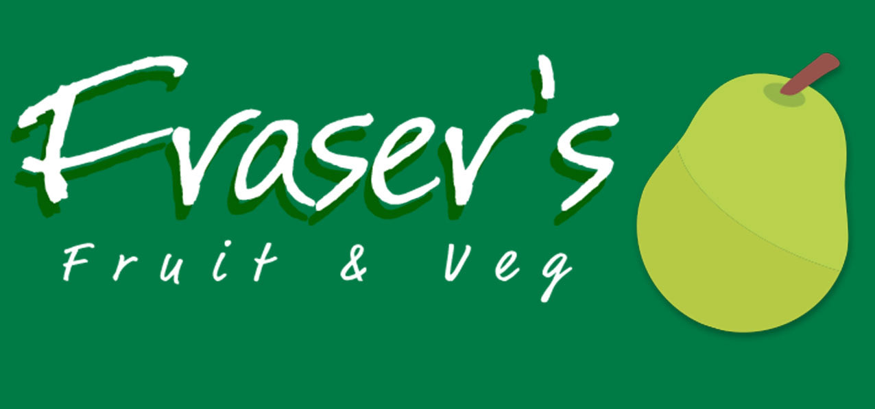
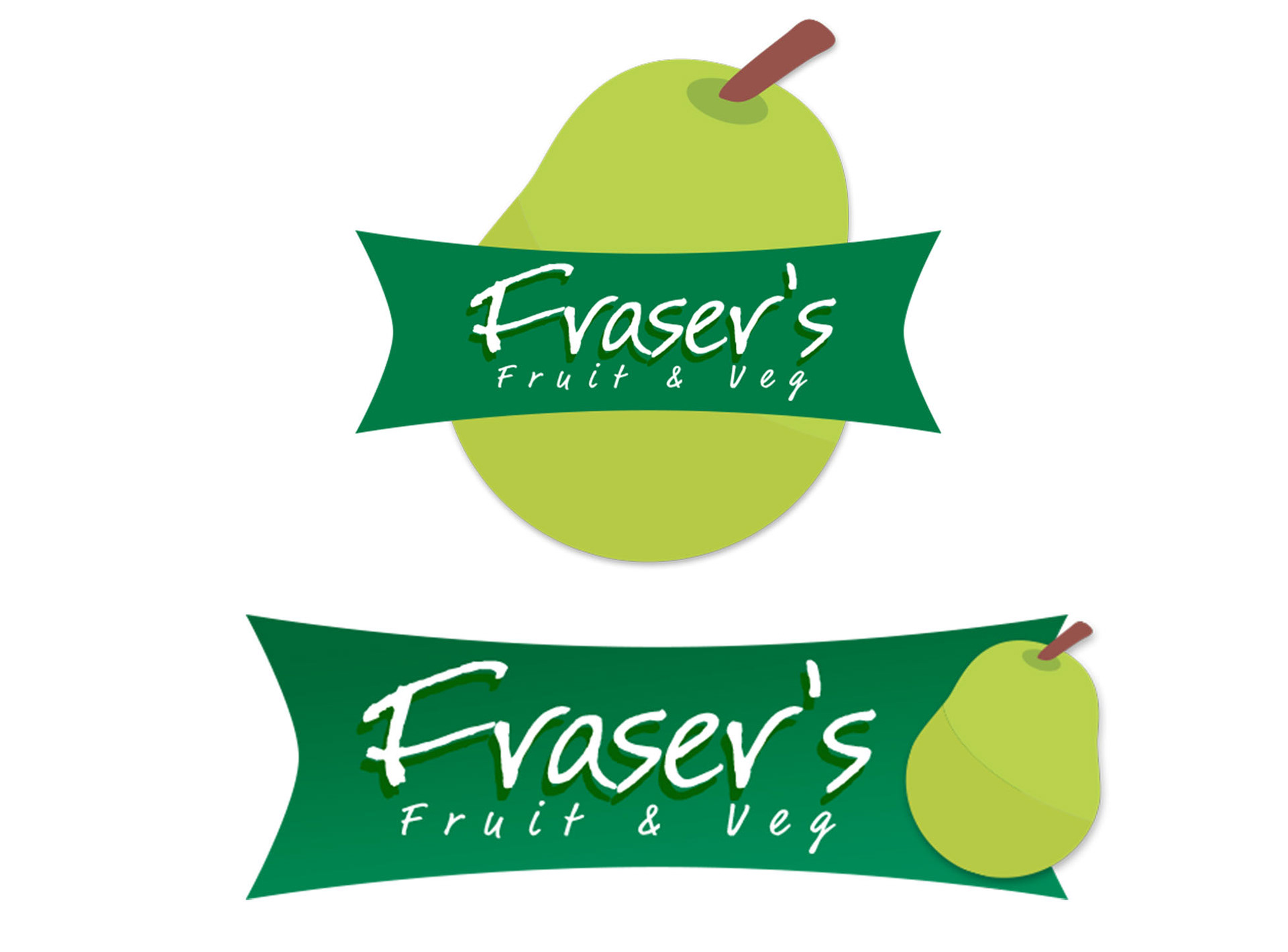
Fraser is a fan of the pear motif which he has on his window vinyls so I tried to keep this theme in the designs.
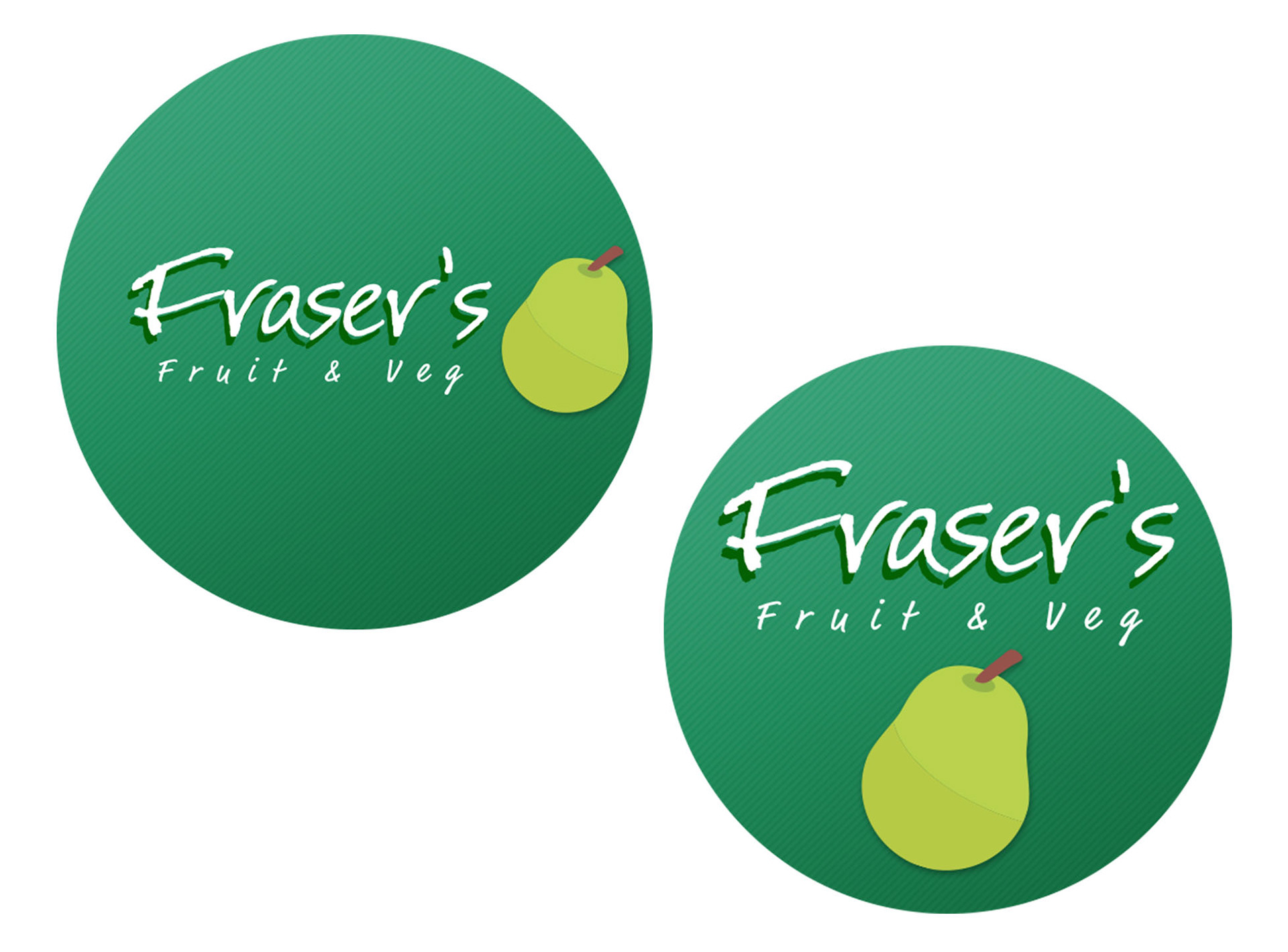
Adding some circles into the logo started to make it look more like a label for bagging or packaging
In the previous logos the pear was used as footnote of the logo. I tried some ideas where the Pear was a dominant part of the logo or at least a little bigger.
I then tried something completely different. Going for a more organic look this time and I tried using a style more fitting of classic crates but with a classical albeit scribbled font.
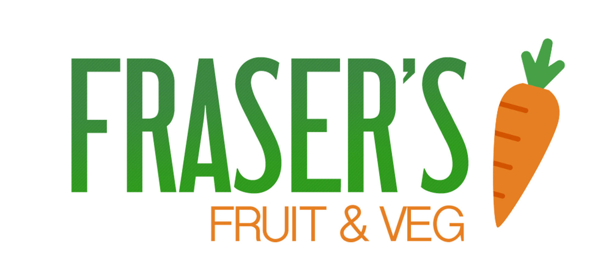
Lastly another type of logo I tried was more going down the material design route. Also removed the pair and added a carrot for a little bit of colour.